Design Color Trends in Printing
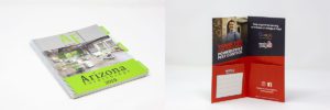
We are close to halfway done with the year. Can you believe it? It feels as though we blinked, and 2019 is almost gone. When we look back at the past 6 months, we see a significant amount of projects completed, and it makes sense how the year is halfway done. If your first half of the year wasn’t what you were picturing for your marketing materials, we want you to enter into the second half with confidence. We’ve pulled our favorite projects and have curated our top print design color trends for 2019 in order to inspire the rest of your year.
These trends are just the beginning of what you can do with us at O’Neil. Let’s dive in!
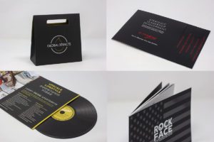
Modern black
This year, we’ve seen a good amount of modern print design, which includes black, white, and foiling. The black is done beautifully with a matte layer on top to give it a unique texture. While we feel black is very modern, it also has a timeless element to it. Your print materials won’t go out of style any time soon with this design color trend. Take a look at how some of the projects we have done in the past 6 months have utilized black in their design.
Warm colors
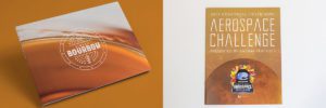
Warm colors are very common in our industry, but it extends to other industries as well. We see the use of warm colors in clothing textiles, interiors, and photography. We especially love how it looks on print though. The mix of warm colors with modern typography is something that we will never grow tired of seeing.
Pastels
Pastels go through phases each year. Once spring hits, it seems that pastels make their debut. This year is no different. Pastels became popular this spring, but they haven’t made their way out yet. We will likely be seeing pastel inspired prints through the rest of summer and leading into early fall.
White space
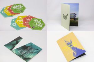
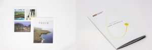
Less is more when it comes to design. Print design is no different. This year, we have seen several projects utilize the simplicity of white space. In the past, it was frowned upon to have too much white space. Now, it is being celebrated, and we love it!
Bright contrast
It used to be frightening when we saw designs that did not go well together, but current trends are pointing otherwise. Lately, we’ve been seeing a mix of colors that are opposite of one another, yet the design looks intentional and engaging. We hope to see more of this design color trend, because it is very unique and unlike anything we’ve printed in the past!
