How to Choose the Best Font for Print
When printing new materials for your business, it is a representation of your business. Ideally, your print materials will match your brand. What happens when the fonts in your brand don’t look great on print? You must go back to the design and consider different font weights or finding a new font all together that is the best font for print.
Print materials should have fonts that are wide open and easy to read. Understand that with some print materials, especially brochures and postcards, less is more. When printing larger items, you will want to use fonts with heavier weight and optimal spacing to make sure it is readable from a distance. Although serif fonts may be the most professional, they tend to also be harder to read.

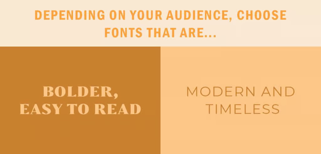
The font you choose for your print must appeal to your audience. If your audience is younger, you may want to consider a modern font. If your target audience is older, you may want to consider fonts that are bolder and easier to read. Another tip is to make sure the contrast is heavy between the font and the background.

Meet with your designer to ensure they are following these tips on using the best font for print and the best font for your audience. If you have any questions about what fonts look great in print, we are happy to discuss your designs further with you. Let us know how we can help with your print needs!


